The Changing Look of Cricket Whites
The changing look of cricket whites reveals how cloth, cut and finish shape the game’s visual identity, with useful clues for reading garments and photographs.
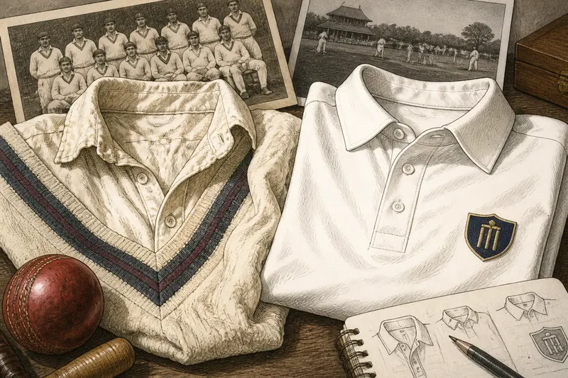
The changing look of cricket whites is easiest to read in the cloth itself: an older shirt may appear substantial and softly creased beside a later one with a smoother surface and sharper finish. White became cricket’s familiar visual convention through repeated choices about fabric and presentation, not because every generation wore an identical uniform.
For a family photograph, an old team portrait or a contemporary match image, the useful question is not simply whether the clothes are white. Their surface, shape and formality offer clues to how the game was presented, while none of them alone can establish a garment’s date.
Fabric and cut offer clues, not dates
Older cricket clothing can read as weightier because the fabric holds a visible fold and sits away from the body. A cotton shirt may show a soft, irregular surface, while knitwear gives the torso a more continuous outline. These are visual clues rather than a dating system: garments can be altered, replaced or preserved in different conditions.
In a photograph, inspect the shoulder, sleeve and front placket. A roomy body and a collar that sits away from the neck create a different impression from a close-fitting cut with a flat, neat front. The contrast concerns presentation as much as comfort: a looser silhouette may seem less managed, while a cleaner outline makes the team look more coordinated.
Imagine you are sorting two undated club photographs. In one, the players wear loose shirts with deep creases and knit jumpers; in the other, their tops look smoother and their collars more alike. Describe the fabric and styling first, then compare badges or other visible details before suggesting which image may be earlier. The result is a cautious comparison, not a date inferred from whiteness alone.
Match the clue to the object
A close-up garment preserves surface detail; a distant match photograph makes colour and outline easier to see; a posed portrait offers stronger evidence of how clothing was arranged for display. Use the clue that the object can actually support.
- Garment in hand: Check the weave, seams, collar and fastening. If the construction is visible, describe it directly; if it is obscured or worn, leave the fibre or original finish uncertain.
- Monochrome photograph: Check how sleeves and collars catch light. If the areas differ in tone, record the contrast without calling them different colours; if the image lacks detail, rely on the outline instead.
- Colour image: Check whether pale areas look warm, cool or uneven. If lighting or image processing could explain the shift, compare the cut and texture too; if those are unclear, avoid a firm claim about shade.
- Team portrait: Check for repeated collars, tucked shirts or matching knitwear. If details recur across the group, describe a shared presentation; if only one player shows them, do not treat the detail as a team-wide convention.
- Badge or trim: Check its position and contrast with the shirt. If it is clearly visible, record the design as a separate feature; if it is blurred, do not use it to identify a club or date.
- Faded print: Check whether the whole image has shifted in tone. If the background and clothing are both warm or grey, allow for ageing or reproduction; if only one garment differs, describe the visible contrast without assuming its cause.
It is not worth trying to identify an exact fibre from a small, faded photograph. “Soft-looking shirt”, “ribbed jumper” or “smooth finish” is more useful than a confident material claim the image cannot support.
Neatness changes the impression of the team
Cricket whites are not a blank background. A collar, button line, tucked hem or knitted layer gives clothing structure, affecting whether a team appears disciplined or relaxed. Smoother surfaces and more consistent cuts can strengthen the impression of deliberate uniformity.
That shift is not a simple march from untidy to modern. A well-kept older shirt may look crisp, while a later garment may appear rumpled during play. Heavier cloth makes folds legible; a smoother surface can make the overall shape seem more controlled.
Badges and trim sharpen the distinction. A small crest makes a plain shirt feel more like a team object, while a contrasting collar draws the eye to the garment’s construction. Keep these additions distinct from the fabric: they may signal identity or presentation, but they do not explain the cloth’s date.
Questions about the changing look of cricket whites?
Why did white become the familiar cricket colour?
White became familiar through custom and repetition, until viewers could recognise its association with cricket at a glance. Its appearance also depends on the setting: pale clothing stands out against grass, timber seating and darker layers.
What can fabric reveal about an older shirt?
Fabric can suggest how a shirt was meant to sit and move: a substantial weave holds its shape differently from a fine, smooth cloth. In a surviving garment, seams and construction offer firmer clues than a broad label such as “old-fashioned”.
Why do cricket whites look different in photographs?
Light, shadow and image reproduction change the apparent tone of pale clothing. A crease may look grey, a sunlit sleeve nearly featureless and an aged print warmer overall, so compare outlines and texture as well as shade.
Does a more uniform look mean every player wore identical clothes?
No. A shared white appearance can coexist with different cuts, layers and degrees of wear. Team portraits may make a group look especially consistent because players were posed together and their clothing arranged for the camera.
Describe what is visible and leave room for uncertainty
For a collection note or photograph caption, record the apparent fabric, cut, layers and visible trim. Separate what you can see from what you infer, especially when the image is unclear. A visual history can describe how whites look without making claims about present-day dress requirements.
The changing look of cricket whites becomes easier to follow when descriptions stay close to the evidence. “A smooth, close-cut shirt with a narrow collar” tells the next viewer more—and claims less—than declaring it the first of a new era.